Thursday, December 15, 2011
Tuesday, December 13, 2011
Essay
Charles Kovach 12/12/11
Essay
My poster is the history of batman. Now why is this interesting or important you ask? Well batman is a superhero who has influenced children for over 70 years. The dark colors and the sharpe angular design interreges the audience. The placement and shape of the text leads down to the central focal point drawing in its viewers. However my design does not fully conform to the rule of thirds, because of the effect of the text converging down to the lower half of the design. This gives it the illusion of batman being dead center when actually he leans more left. I applied the principles of design as batman the title and batman the illustration being the points of emphasis. Contrast of white to black and the two shades of blue in the piece. I used repetition in the starburst pattern background and in the colors I used. I used alignment with the text and background shapes, the text balances what would have been top have piece. I used flow in the ripples going down his cape to give it a more finished appearance. The color sets the mood and works to enhance the pieces intensity, while the type keeps the balance and leads to the main focal point of the piece.
Sunday, December 11, 2011
Tuesday, December 6, 2011
Tuesday, November 29, 2011
Art styles
Art Nouveau
- Flowing lines- graceful and sinuous
- Lines almost never are angular
- Violent/Whiplash curves
- rhythmic curvy lines connect images in the art

Art Deco
- Uses imaginative deep colors
- Geometric shapes
- Zigzags
- Trapezoids
- Over the top curves

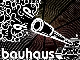
Bauhaus
- Forms are all simplified
- areas of color
- Usually done in black, yellow, and red

Constructionism
- Loud pieces
- Geometric or technoid primary shapes
- Arranges shapes in a harmonious order
- Use of colorful palates
- Don't use brights
- Play with light effects and movement
Thursday, November 17, 2011
Tuesday, November 15, 2011
Thursday, November 10, 2011
Thursday, October 20, 2011
Favorite stamps
- The first stamp on the left is one of 10 that was to commamerate stars of silent movies. Worth 29 cents made in the U.S.A the cartoon style of the stamp was done by new york artist Al Hirschfield and released in 1991. The stamp has vertical type of the subjects name that is in alignment with the boarders of the stamp. The cartoon is abstract lines that come together with their negitive space to form the image of Lon Chaney.
- The second is a breast cancer reasearch stamp released july 29, 1998 in the united states. the stamp cost 55 cents. This stamp also use abstrat lines to form it subject but also uses collors to give more interest to the drawing. The stamp has type in the forground of the piece that stands apart from its colorful backround to grab the emphasis of the stamp.
- The third stamp was released 11 March, 2010, the U.S. Postal service issued a postage stamp for 44 cents showing art from one of the most prominent abstract expressionists Hans Hofmann and one of his most famous painting "The Golden Wall."
Wednesday, October 5, 2011
ESSAY
This project was to use the principles of design Emphasis, Balance, Contrast, Repetition, Alignment and Flow, and turn them into a unified design.
For this project I was confused from the start. I had a rough understanding of design concepts but almost no knowledge on how to implement them. When I saw the finished projects of the past students I was worried about the technology. I’ve had all of my previous experience in a studio setting to the point that before a few years ago I didn’t know what photo shop was. Sad, I know.
In the first round thumbnails it was hard for me to get more than a few that met the criteria. My designs were all more or less off the top of my head and somewhat static. I did manage to pick at least one of each to build off of. For “Emphasis” I used a set of large “E’s” to encompass the rest of the word that actually aligned with the top and bottom of the “E’s”. For “Balance” I thought of building blocks. Remember, those towers you used to make as a kid. I had spelled out the word in the shapes of building blocks with one block teetering off balance from the tower. “Contrast” I designed as boxy set of letters where the size of the C to T got smaller as if it was passing through planes. For “Repetition” I had thought of well Jurassic park really where the doctor wets his finger and does his test with the lady archeologist Later the T-rex comes and the cup creates ripples . . . I recreated that. I couldn’t quite grasp the concept of “Alignment” and it showed in my sketches. “Flow;” I had sketched out a 3-d version of flow and had flow passing through it penetrating the foreground mid ground and background.
In second round we were supposed to take the sketches we picked in first round and draw them as basic shapes, I was at a total loss. But I came up with two ideas I thought I could use. 1 using the rule of thirds to take the shapes and lay them out in a way I thought was neither too crowed nor to empty. It made interesting use of the negative space and the interactions with the shapes.
During the third round sketches I only used one of the five thumbnails from the last round and came up with four completely different ideas. The four I had come up with either didn’t make use of the words meaning in my designs or were too crowded or just uninteresting. The sketch I went with made some use of my first round ideas for the words contrast and repetition with only slight changes. I had used the rule of thirds to place my focal point “Emphasis” of to the left of the design so it wouldn’t look squished. I wanted to make it stand out. I had “Contrast” actually pass thought it so that’s where your eye went next. With an invisible line to “Balance” which rested on the “Flow” that encompasses most of the design space. Interestingly, I’ve been told, flow flowing on a line from one corner to the next makes the design look like a baseball.
For the final stage of the project I made two computer renderings. The first was too crowded and ultimately was rejected. The second one, with some alterations, was a much more appealing design. I used the rule of thirds as the grid to plot out the placement of my concepts. “Emphasis” was placed on the off left side of the design and given depth to make it the front ground of the design. I chose the largest text to make your eye go there first. “Balance” is going through “Emphasis” and is in the middle ground so as not to take too much attention away from “Emphasis” while still leading the eye. “Contrast” has a gradient affect. I altered the perspective so it would take you from the large light C to the small dark T. “Repetition” is the frame of the design. It encloses where the viewer’s eyes go in the design and also makes interesting negative space. I also have “Repetition” in my use of “Alignment.” “Flow” travels through the foreground midground and background. “Alignment” is placed in the spaces the font makes in “Emphasis.” This allowed me to add to the effect of “Emphasis” leaping out of the design which only served to add more “EMPHASIS.”
Tuesday, October 4, 2011
Wednesday, September 21, 2011
Subscribe to:
Comments (Atom)


